Showing Our Work: Design Economics

Showing Our Work
Photo by Irving Rusinow [Public Domain], via Wikimedia Commons
You start a new project and receive a heap of content from stakeholders. Your shiny new stack of content arrives with an expectation from the project owner that you deliver that content (every ounce of it) to the mental doormats of their audience. In an attempt to do the right thing, you dutifully conduct an analysis of the performance & skills that the program you’re helping needs to address. You get to know the audience. You frame a set of performance objectives around a reasonably rigorous analysis.  Despite this effort, you’re still stuck with big pile of content.

The tail wags the dog. You dive into the rabbit hole head first. You search for aesthetically pleasing layouts and graphics that will grab attention. You look for ways to make an awful experience less awful. Soon you’ve invested a ton of time trying to engineer treatments for content and you’ve lost sight of the purpose of the solution (if ever there was a purpose).

Sound familiar? You bet. When you enter into a battle with content treatments, it’s easy to get lost in the noise. That noise makes it easy to lose sight of the things we can do to really make the biggest difference. Unfortunately, this unenviable situation is far too common. It seems unfair to give information this much of our attention, doesn’t it?

Noise

In the performance solutions field (ISD, learning experiences, whatever you want to call what we do), we often look at other fields of discipline for guidance and inspiration. We often examine other design disciplines or areas of media production, looking for better ways to position and polish our communication. As helpful as these fields might be, we may be overlooking an important, albeit less sexy, discipline. The field of economics may hold one key to making solutions worth the effort we put into them.

Economics is a process that converts inputs that have economic value into outputs that also have economic value.

In design, we deal with many factors and artifacts (currencies). Ideally we’ll weigh all of the inputs we can to make decisions that provide the best trade-offs and consequently the best outputs and value for all stakeholders, given the inputs we have to work with. Content is just one of these currencies. Other currencies include:

  • Target accomplishments
  • Tasks that enable the accomplishments
  • Skills that enable the tasks
  • Components of the skills that enable the tasks
  • Audience factors
  • Environment factors
  • Technology supports / constraints
  • The client’s wants
  • The client’s needs

An experience itself is defined by economics. Good experiences consist of moments that drive towards the design intent or the goal of the solution. That’s a deep one, I’d rather go down that route in another post.

Good economics supply greater value in the outputs than the inputs, making the outcome worth the effort. While it’s not as sexy as User Experience (UX) or game design, doesn’t economics sound like a field worth looking into?

Make the outcome worth the effort.

Often, maybe too often, we make decisions that seem to draw magic lines between content and solution without consideration of the intent of the aggregate of those decisions. Starting with purpose in mind is a sensible guideline. It’s easy and intuitive to point to this and say “Yeah, that’s the right way to do it” but it’s challenging to follow in practice. I guess that’s why we call it a discipline.

Here are two suggestions you can use to battle the magic leap and increase your effort to outcome ratio.

  1. Look at your solutions as economic problems. Map the structure of your problem so you can know exactly how the structure of your answers matter in the big picture. Understand the structure of the task down to the skills and all of the factors that shape the execution of the skill. Know what concepts drive the skill. Know common interpretations of a rule that influences the execution of the skill. Use this structure to validate your decisions. If something doesn’t stick, dump it.
  2. Don’t start with content. Don’t get hung up on content. While content is often an important artifact, it’s the wrong starting point. And in many cases it hadn’t earned the effort we often invest in it. Getting lost in the (often horrible) noise of treating content is a great way to lose sight of the big picture and is a terrible way to deliver value. It’s hard to win the performance war if we tie all of our energy up in a content battle. Content is a means to an end. Starting with a focus on content will make it a slog for you and a slog for your participants. Pick another starting point.

Everything we do and every choice we make has a cost. Every cost stacks debt. That debt can manifest as time, money, disappointment, or simply things you need to fix to make it work (costing time, money, and disappointment). This debt adds up. Design is an economic problem. How do you account for your design debt?

In follow-up posts, I’ll talk a little about a process I’ve been exploring to expose a deeper look at the currencies we use in design and a way to change the tendencies we have that give so much weight to content.

How are you showing your work?
Narrowing the Solution Field – Part 2

In the first part of this series, I introduced an approach for making selection of interventions a little less arbitrary. In this installation, I’ll refine process funnel a bit to round out and clarify definitions of the output levels.

When using processes like this, I think it’s important to keep in mind:

  1. There is no magical process or algorithm to make design decisions automatically. Because of all the factors at play, this stuff is work. Doing it right takes rigor and  discipline. Anything short of a disciplined approach is rolling the dice.
  2. Design is a complex business of weighed options and trade-offs. The answers are almost never easy and there is rarely only one answer.
  3. This process of refinement isn’t linear. It IS iterative and involves making and validating assumptions.
  4. Design is a process of illumination. You can’t solve a problem that you can’t see.

That said, models and tools for thinking through problems can be really helpful to shake things loose and help you to show your work.

Continue reading Narrowing the Solution Field – Part 2

Just a Nudge – Getting into Skill Range

I may have mentioned somewhere that I was active duty USCG for a decade or so, a decade or so ago. If I hadn’t, I have now.

Active duty members of the U.S. Coast Guard get the opportunity to take on jobs like boarding team member (BTM) or boarding officer (BO). While qualifying as a BTM or BO, you become intimately familiar with law enforcement concepts like the use of force, authority and jurisdiction. One of the common tenets of use of force is only apply the minimum force necessary to compel compliance. That means you don’t use a take-down or baton when a professional tone will get the job done. Even when not considering compliance as the goal, this concept be useful when designing instruction performance solutions and experiences that support learning.

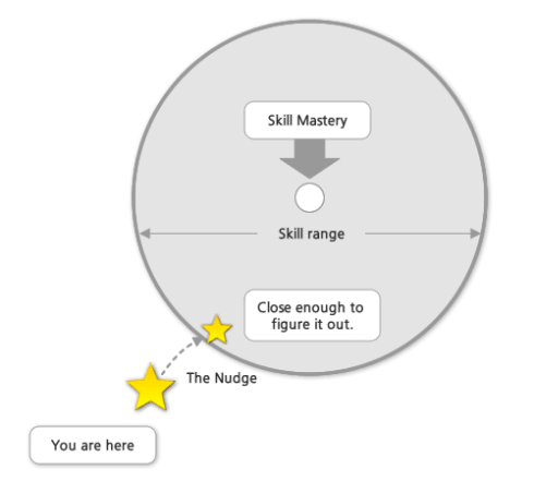
This is the visualization of an idea that’s been in my head for awhile. It stands as a rationalization against the pursuit of instructional perfection. This rationalization assumes that learning is a function of the learner and instructional perfection is a futile goal. In my view, attempting to design for perfect skill mastery can actually defeat or smother the natural learning process. I’m pretty sure this concept isn’t an original idea.

Think about a concentric circle with two separate borders. The first border at the center of the circle is skill mastery. This is the zone representing the skill level of people that have have been practicing for a significant period of time and have ascended through the ranks of apprentice and journeyman. The master of a craft has typically poured more into their own development than the average performer. The master has pursued mastery and has probably reached this level of mastery with the careful and loving assistance of a master of the craft. The second border on the outside is the skill range. This defines the minimum level a performer would need to reach in order to “figure it out” and succeed in a task or set of tasks that require the same skill.

This concept assumes that skill mastery is rarely required for accomplishment but does NOT exclude skill mastery as a target when pursued by the performer. Imagine a booming emphasis on “pursued by the performer” voiced by James Earl Jones. I don’t believe skill mastery is driven from the outside. People only reach mastery when they really want to. Never by accident.

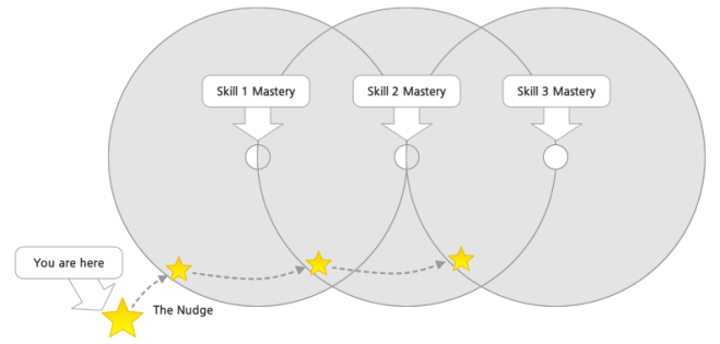
The idea here is to design solutions to provide just the right nudge at just the right moment to place folks within range of successful accomplishment. Given the right environment, people can be remarkably adept at figuring things out. If we rob learners of the opportunity to “figure it out”, we risk missing the mark entirely and increase the probability that learning won’t stick or the type of learning that takes place won’t connect in the way we, or more importantly the learner, needs it to. To me, instruction performance solutions and experiences that support learning should be designed as a nudge to help the performer learn just enough to get within range of the next thing or success in the task at hand. Nudge, get out of the way and be ready to give another nudge in a right moment.

Job aids and performance support can serve as perfect nudges — getting out of the way when needed and appearing at just the right moment at the request of the performer. Maybe we can spend more time building for just the right nudge in the right moment and less time building over-engineered content packages?

Instructional perfection is a unicorn. A mythical creature. The effort expended to reach it is not only wasteful but probably defeats your design purpose. Design for nudges and watch deliberately from a distance. Time spent connecting your learners with just what they need, even when that need is another journeyman or master to help guide them, is time well spent. Your learners will excel until they need another nudge and since they used their own natural learning process to move through the skill range, it’ll be far more indelible (they’ll remember the experience).

This doesn’t mean a designer is completely hands-off — it merely means you need to treat your audience as capable learning machines. Because… they are.

In the business of L&D, we tend to beat folks into submission with information. We should really ask ourselves, what’s the minimum force I need apply to compel the desired outcome. We need to be prepared to stop there and stay out of the way. We aren’t the source of learning magic. They are.