Earlier this week, my team received new tasking to design a solution to help meet pent-up demand for a mandated curriculum. Like any design project, there are problems. Some of these problems are more evident than others.
What’s the problem?
It quickly became clear that the existing solution was almost entirely focused on content with a tiny glimmer of application. The verb “discuss” was central to nearly every objective that framed the existing solution. In an organization so intensely focused on action, I couldn’t (and can’t) see a rational connection between “discuss” and “do”. This is the first obvious problem. We can do better.
The last objective framing the course was something like “pass a knowledge based test.” This is the second obvious problem. This objective frames a mechanism, not a performance expectation that aligns with a business or mission goal.
Even when a mandate culminates in passing an examination, shouldn’t the solution objective transcend the mechanisms used in the solution? Including a solution mechanism as a learning or performance solution framing objective just seems wrong.
What I really need…
As I reviewed the existing course, I really longed for a mapping of the connections and relationships within the solution and a clear picture of the problems the current solution is solving. I wanted to discover the nature the solution without having to reverse engineer the materials. We’re probably going to conduct a brief job task analysis, but it would be really nice at this forming stage to have a clear model in hand.
What real-world goal does the solution align with? What tasks does the solution support? It occurred to me that we don’t commonly employ a method or strategy to consistently represent the complexity of the performance structures in a meaningful and visual way. Without this view it’s very, very difficult to see problems, challenges, and opportunities clearly. Can’t see a problem, can’t solve a problem.
Where is this going?
I’m a pushover for simple hierarchical models for classifying elements and organizing problems, challenges, and concepts into taxonomies and ontologies (more in a logical sense than a philosophical sense). Isolated elements tell one story. The connections and relationships between these elements tell another, often far richer story. When you can clearly see what’s there, it’s infinitely easier to see what’s missing.
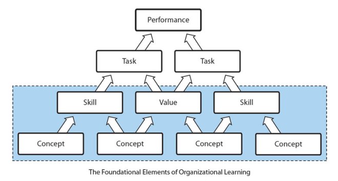
I frequently use this simple representation to illustrate a performance hierarchy and a generalized sense for the ontology of work and cognitive challenges with achieving the outcomes associated with the work. Content is intentionally excluded in this illustration.

What if we were able to map all of the relationships and connections between elements in clearly defined categories within a hierarchy? Would this help to identify sticky points and the biggest problems? Could this help to prioritize solution focus and reduce arbitrary decision-making during design? Could something like this be helpful? I think so.
Consider this for a moment…
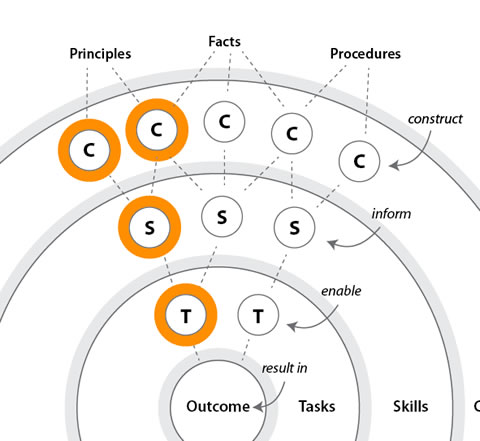
Content helps people construct concepts. Concepts inform and help develop skills. Skills enable the performance of tasks. The performance of tasks results in outcomes.
By this representation, there is a clear chain that connects a procedure, principle, or fact to an outcome. And it’s almost never a direct chain. Take this simple chain definition a step further assuming that the outcome is the nucleus of the map.

If we assume relatively consistent hierarchical connections between the concentric elements that contribute to the outcome, we might begin to see a fractal arrangement that provides opportunities to see where the real challenges are. The center of this fractal arrangement is the outcome, not the content.

Supported by data to validate assertions emphasis could be represented in the map. Immediately, you start to see where the biggest problems are, where the sticky parts are and which trends represent the biggest opportunities. This is potentially really meaningful. For most folks, this is probably a far more meaningful way to convey relationships and models than a stacked report or data set buried in a document.
Usable Tools are Better than Conceptual Representations
The concept of a representation is useless if there isn’t a method that helps folks get there from here. As much as I love technology-based tools, I can truly appreciate a well-crafted analog toolset and will choose analog over digital when given a choice. I just feel better about a tool that I can crumple and throw away if it’s not working (but dig back out of the trash if it comes to that). Analog tools are just more meaningful and fluid to me.
So I set off to construct a set of simple but useful tools as “soup starters” that I hope would help drive conversation and help to make the structure more visible. I’m still working on these, but if you can see some way to use them, please do. Better yet, if you can see ways that they might fit your contexts better, please fire away. I’d love to improve and expand this concept if it’s useful. So if you happen to print these out and use them, please provide feedback on their utility. If these work well, I’d love to fill a toolbox with these starters.
The page of the document is a conversation and map starter for the dimension of things that surround the outcome (or what we call the Major Accomplishment in HPT speak). The second page is a blank ring board. Use this as a baseline for drawing in a map of your tasks, skills, concepts, and content elements.
Closing thoughts. Where else could a map be helpful?
It’s clear that the lack of a clear visual representation of the problems and performance model makes complexity of context difficult to see. This feels like a common problem. Could a dearth of a meaningful visual representation be handicapping our performance analysis reports in the same way? I think the answer is yes, but will leave that question for another time.
4 thoughts on “Make the Structure Visible”